Creating a colour palette for your brand
- Crib Creative
- May 25, 2020
- 2 min read

Colour is just one of the many elements that make up your brand as a whole. Your brand colours play a huge part in how your clients or customers see you. Research shows that around 85% of consumers believe that colour is a huge motivator to choose a particular product, while around 92% believe that visual appearance is the most persuasive marketing factor.
When you think of some of the world’s most well-known companies, there’s a big chance that their brand colours come to mind – for example the red and yellow arches of McDonald's or the bright green of Spotify. This is because they know their colours, and they stick to them year after year—no matter how much their product or service changes.
By creating a colour scheme for your business you give yourself the opportunity to create a memorable identity. However, it’s not always as easy as picking a few of your favourite colours –to keep your brand aesthetic strong and consistent it’s important to have a go-to colour palette that has been well thought out.
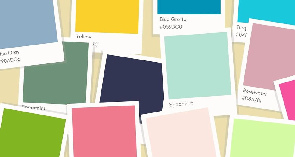
So,what exactly is a colour palette? A colour palette is a combination of shades that you use across all of your visual branding there’s no limit to the amount of colours you can or should have in your brand palette, however it’s important to keep in mind that using too many colours can make your brand and marketing items look cluttered and overwhelming. Keep it simple and consistent across the board.
In order to choose a colour palette, first you will need to consider your audience and what your brand values are. For example, are you a feminine brand that creates beauty products for young women? Or are you a brand for children, and you value fun and creativity?
Next you can look at colour associations. It has been scientifically proven that different colours can evoke different feelings and emotions. For example, the colour red may stand for love and passion or danger and excitement, orange may come across as fresh, youthful, creative and adventurous, while blue is more relaxing and peaceful and can be communicated as trustworthy or communicative. Once you’ve picked a few colours that you think get your message across, you will need to figure out which colour combinations actually work well together. Below are a few helpful links we found on CANVA to assist you with this! Canva Colour Wheel If you want to know which colours actually look good and work together, Canva’s colour wheel is a great tool! https://www.canva.com/colors/color-wheel/

Canva Colour Palettes Here you can search key words, colours or themes to find an already put together colour palette made with colours that work well together. https://www.canva.com/colors/color-palettes/

Another fun way to experiment with different colours and work out your ideal colour palette is to create a mood board using colours extracted from images. Canva also has a colour palette generator where you can upload photos and it will automatically create a colour palette from the photo! Check it out here: https://www.canva.com/colors/color-palette-generator/

125%
2 / 2


Comments